Sunday 30 August 2015

REMBRANDT'S ARTWORK

Rembrandt Harmenszoon van Rijn was a Dutch painter .He is generally considered one of the greatest painters and print makers in Europe and the most important in Dutch history. His art came in a period of great wealth and cultural achievement that historians call the Dutch golden age of painting, his paintings were extremely realistic  and innovative, and gave rise to important new genres in painting.

He won the success as a portrait painter at a young age, Rembrandt’s later years were marked by personal tragedy and financial hardships. Yet his paintings were popular throughout his lifetime, his reputation as an artist remained high, and for twenty years he taught many important Dutch painters. Rembrandt’s greatest creations were portraits of different people whom he knew or got to know, self-portraits and scenes from the Bible. His self-portraits were unique and intimate biography, in which he was able to show himself in the different ways he viewed himself to be at that point of time.

In his paintings and prints he exhibited his knowledge and interpretation according to the requirements of his own experience. The depiction of a biblical scene was portrayed  by Rembrandt’s knowledge of the specific text, his assimilation of classical composition, and his observations of Amsterdam’s Jewish population Because of his empathy for the human condition, he has been called “one of the great prophets of civilization.”


For me the realistic and the precise detailing of the human face was the most amazing and fascinating thing in his art but the self-portraits were some of my personal favorites  . His paintings just reflected the unedited portrayal of the body and how it works with one’s mind or one’s current state of mind. He unapologetically portrayed in the way he saw himself and not how others wanted to see him as. 

THE TRAIN OF LIFE

The movie starts off with a man, Shlomo running in a crazy manner all around his town, his voice playing in the background, saying that he has seen the Nazis in a nearby town. Once he gets to his destination, he proceeds to inform the same the rabbi and the entire population of the said town. In a few hours, they assemble all the townsfolk and meeting.  Many of the men do not believe the terror that they are being told of, and many criticize Shlomo for feeding them bullshit, for he is known to be the town lunatic. But the rabbi believes him, and then they try to tackle the problem of the coming Nazis who are sure to drag the entire town of Jews to concentration camps.

Amidst all the confusion and chaos surrounding the topic of what needs to be done, Shlomo suggests that they should build a train, so that they can escape . Some of their members can pretend to be Nazis in order to transport them to a concentration camp, when in reality, they would be going to Palestine, their holy land, through Russia. The way the escape plan works out is actually quite magical and frankly speaking surreal. They happen to purchase and become owners of a train that is extremely shabby and banged up by midnight and somehow it becomes spotless and looks as good as new within a few hours of people working on it.

While on their escape, the train and the villagers experience misunderstanding between the villagers, encounter with real Nazis, Communists, and gypsies and the finally they arrive right in the middle of German and Soviet fire.

The movie ends with Shlomo himself, who recites the stories of his ‘train mates’ after the train arrived in the Soviet Union. According to him some went on to Palestine, some stayed in the Soviet Union, and some even went to America. As he is telling this, the camera close-up of his face, he says, “That is the true story of my shtetl…”, but then the camera zooms-out, showing him grinning and wearing the striped prisoner’s clothes of the concentration camps and is shown to be behind the behind the barbed wire of the said concentration camp. He ends with, “Ye nu, almost the true story!.”  So I am assuming that he became completely mad because he had seen most of his companions and townsfolk executed, including the girl he loved dearly. He thus made up this whole story for himself in order to give him some sort of solace that is the fact that HE was able to save his entire town despite being a lunatic.


The message that I  got through this film  was that no matter how insane or absurd an idea is, it’s still a masterpiece in itself and even the most impractical design is still achievable. It was the very definition of the quote - “If we can dream it, we can achieve it .”

THE KITE RUNNER : HOW IT RELATES BODY AND DESIGN


The movie started out with a story placed in Afghanistan. It was about the two children; Hassan, the servant’s child and Amir, the son of the master. Hassan is shown to be an extremely loyal and strong minded person. In fact, his loyalty was so strong loyal and strong that he would do almost anything for his friend Amir, even going as far as t saving him from bullies almost all the time. Amir on the other hand, Amir is a timid, soft natured and cowardly child who shies away from confrontation.

The story is about how the two ones get separated, due to a brutal violence committed by a trio of boys on Hassan. This one scene is used as a very strong portrayal of how the world works and how violent the people living in it truly are.

By the end of the movie, due to harsh circumstances, Amir is shown to have changed completely and also ended up being able to stand up for himself and not shying away from confrontation no matter how ugly it got.

This was one of the most beautiful and tragically haunting films I have ever seen. This film is definitely not the kind that I could just watch and forget. But due to the course that I am currently taking, I got a new perspective of looking at and observing things which have greater meaning rather than just the parts for show.

Throughout the story I could interpret the meaning and the way design has been used by man to turn around the changes they are not comfortable with, but I could also see how some designs affected adversely on to a fraction of the people living there and how they didn’t really have any but to go along with that particular design. So what I came up with was a statement or an ideology of design and its connection to the body.

A design should be such that it binds the body and takes into account the needs of all the organs comprising of the body .The body here is referred to all the aspects of the design, therefore the design shown in this film was the violence created in the society and the body was the people who were affected by it and also included the people who were the cause of that brutality.


After watching the film it was really hard and confusing to relate it with design, partly it was also due to our facilitator filling our minds with deep thoughts and confusing us about the connection even more but then eventually I did get the connection. I had to watch the film twice to really understand it though. All in all, that session was one great session and not only did I have fun but I also got various new and different insights about my course subject.

PAINTING THE WALLS


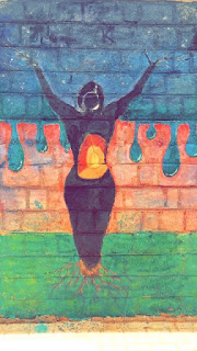
In our class, we had to paint something on the college walls that represented the body. Our group represented the elements of the earth - air, water, fire and earth - through a woman. The woman is shown growing and branching out; yet holding all the elements together and balancing them.

While working on this with the team I was in, I learnt quite a bit - in both designing as well as artistic aspects. In our heads, so many ideas were running through - so many words came to our minds when we thought of the word "body". So finding a common ground to represent all our ideas was rather tough, but possible. 

What we pictured in our heads and what we ended up with were pretty different. As we were painting the wall, more ideas and different methods of representing the ideas came to our heads, and we spontaneously added them (with the rest of the groups' consent, of course). 


Working with different kinds of paint, finding the correct proportion of each color and generally working with different color schemes and combinations was also something I learnt from this activity. Overall, I felt it was a good combination of thinking, executing and simultaneously having fun. 


THE BLIND BAG


The diagrammatic design of the product and the the prototype model. 

ARDUINO MOTION SENSOR ALARM:

How does it work?
Here, we are using a PIR motion sensor. PIR stands for Passive InfraRed. This motion sensor consists of a fresnel lens, a infrared detector and supporting detection circuitry. The lens on the sensor focuses any infrared radiation present around it towards the infrared detector. Our bodies generate infrared heat and as a result this gets picked up by the motion sensor. The sensor outputs a 5V signal for a period of one minute as soon as it detects the presence of a person. It offers a tentative range of detection of about 6-7 m and is highly sensitive.

Working of a PIR motion sensor
When the PIR motion sensor detects a person, it outputs a 5V signal to arduino. Thus, an interrupt on the arduino is triggered. And we define what the arduino should do as it detects an intruder. Here, we are creating an alarm sound through a piezo buzzer/an ear plug. Therefore, when the sensor detects an intruder, an alarm sound will get triggered through the buzzer.
The piezo buzzer or an earplug  is activated through the arduino using PWM signals which is attached to the chest piece.
The product we are  planning is for the blind people which will use this basic technology which will enable them to be more aware of the surroundings and not get into accidents.

Materials used :
Bag , Arduino board, connecting wires , motion sensor,earplugs , box , cloth pieces ,velcro strips, sewing thread and needle, pvc pipes , metal rods ,elastic bands , 

Sources researched : YouTube , Wikipedia ,Google.


COGNITIVE MAPPING

This is the method which we can use for attaining a proper description for a particular
 product or art work. The description is almost always present in our subconscious mind but one is not able to explain what one have done because of the lack of appropriate words .

Here I was able to come up with the a description for the product that I and my team had worked on. I started the process by throwing and playing with all the words which was some what related to the product or what I thought was relatable with the product and then I started to building up on the connection that every word has to which ever other word that I had written down on the paper. Then I chose the words which had the most connections and eventually made my product description with those particular words.

The second image is the diagrammatic representation of the Emotional, Contextual, Intellectual and Experiential aspects of the product .


A MULTIPURPOSE DESIGN MADE TO HELP THE VISUALLY DISABLED LIVE THEIR DREAMS.

The shapes shows the following :
Circle   : experience 
Square :  context
The Tilted Square :  intellectual  

The Irregular part : emotional

Friday 28 August 2015

DIFFERENT KINDS OF PAINTINGS AND THEIR DESCRIPTIONS


In class, we were asked to Google images of different kinds of paintings and write the description based on what we see. The following are the different types of paintings we looked at: 

Gond Paintings 

This form of tribal art is based on nature and wildlife. The paintings are geometrical and very brightly colored.

Kalamkari Paintings

The color scheme used is red, maroon and yellow. Their paintings mainly depict the Gods and a few animals.

Mughal Miniature Jahangir 

These paintings are mainly portraits of Jahangir itself. They're a lot similar in comparison to those of Akbar's. 

Malwa Paintings 

The use of the color red and yellow is very prominent. They portray scenarios in and around the palace.

Deccani Paintings 

The colors used are slightly dull in comparison to the rest. A lot of of dull greens are used.

Jaunpur Paintings 

These paintings are very architecture-based, and the colors used are not too bright. 

Shekawati Paintings

A lot of intricate designs and patterns are used. The use of the color maroon is very prominent. 

Bundi Paintings 

These paintings are based on dancing women with long, flowing skirts. 

Kishangarh Paintings 

These paintings depict humans - either singularly or as a couple. A lot of blues and greens are used. 

Mysore Paintings 

Attention to detail when it comes to human features and cloth patterns is seen. There's high usage of the colors red and gold. 

Tanjore Paintings 

These paintings depict different Hindu Gods. They all have plain-colored backgrounds and a lot of the color gold is used.

Jain Patachitra 

Use of bright colors is seen. All these paintings have framed patterns. Gods are depicted, and very intricate patterns are used.

Buddhist Thangka Paintings

Buddha is depicted in every painting. A lot of circular forms are used. There are vibrant colors used in every painting. 

Ajanta Vakataka Paintings 

These are cave paintings which portray human figures. Dull colors are used. 

Kerala Mural Paintings 

Intricate paintings with a lot of use of the color red. These paintings depict Gods. The human figures are very curvy. 

Odisha Pattachitra  Paintings

These paintings are bordered with intricate patterns and designs. 

Kalighat Paintings 

A very subtle color scheme is used. Most of the pictures comprise of female figures. The backgrounds are blank. 

Jamini Roy Paintings 

These pictures depict cartoon-like human figures. Dull colors are used in the paintings. 

Company Paintings 

These are very realistic looking paintings depicting scenes from olden times. Mild colors are used.

Gulam Mohammed Sheikh Paintings

These paintings are very vibrant and colorful. They're also very abstract. 

Bhupen Khakhar Paintings 

Modern art depicting men. The color blue is used a lot. 

Ramesh Kalkur

His paintings deal a lot with the human body.


Friday 7 August 2015

THE MODERN GODDESS

Today, we made a Goddess which suited our own sensibilities and also sort of embodied the modern era. I drew the Nature Goddess in her modern form.

The crown on top of her head signifies that she is the modern day queen who fights to save the world from pollution. 

The naked torso embodies the fact that she is a confident woman that refuses to be brought down by anyone which is the case with almost every woman in the 21st century.

The the sort of Aztec jewelry that she's wearing emphasizes that she is one that has changed herself according to changing times and doesn't wear the heavy gold jewelry that her much older counterparts wear.


The plain sari on her bottom half talks about that fact that she is an Indian goddess and that she is very simple in her tastes and doesn't need extravagance to survive. 


ARTIST REVIEW PART 2: MARINA ABRAMOVIC

Towards the late 1950s, as abstract art began to lose impetus, many artists across the world began to embrace performance art. Performance had been a feature of avant-garde art since around 1910, but Marina Abramovic's work is typical of the aims of the new generation in her eagerness to avoid traditional, object-based art materials (such as paint and canvas), and to cut down the distance between the artist and the audience by making her own body the medium. Born under Yugoslavia's repressive Communist dictatorship, and raised by parents closely tied to the regime, Abramovic's dramatic and dangerous performances often seem like cathartic responses to these early experiences of power. She has produced a quantity of sculpture, but she remains best known for performance, and she remains one of only a handful of performance artists of her generation who have continued to perform late in their career.
Marina Abramovic's work is typical of the ritualistic strain in 1960s performance art. It often involves putting herself in grave danger and performing lengthy, harmful routines that result in her being cut or burnt, or enduring some privation. She views her art almost as a sacrificial and religious rite, performed by herself for a congregation of viewers. And the physical ordeals she endures form the basis for exploring such themes as trust, endurance, cleansing, exhaustion, and departure.

We might interpret her work as having displaced art from traditional media such as painting and sculpture, and moved it directly on to her body. Yet far from conceiving it as simply a surface, she has said that she thinks of the body as the "point of departure for any spiritual development."

Between 1976 and 1988 she collaborated with the German-born artist known as Ulay. The performances the pair created during this time often exploited their duality to investigate ideas such as the division between mind and body, nature and culture, active and passive attitudes, and, of course, between male and female.

One of Abramovic’s most famous performance arts is Rhythm 0. Abramovic was lying on a table and next to her on another table were 72 items like, scissors, honey, band aids, blade, knives, etc. the spectators were allowed to do whatever they wanted to do to her and there was also a sign which said that the people would not be responsible for their actions. It was then that the true nature of people came out. By the time the performance was over, marina was covered with cuts, gashes and tears were coursing down her cheeks. The moment she stood up and got down from the table, the participators fled from the room. She has a moral or a purpose attached to every performance that she stages. In this case it was the fact that though 90% of humans on this planet are extremely cruel in nature when given free reign, they cannot stand the fact they were able to inflict such torture on another person. They realized that they can’t look themselves in the eye.

Marina Abramovic, according to me is an extremely optimistic person. Even after what was inflicted on her by the participants, she did not lose faith in the fact that people were a good bunch and still spent time trying to convince them of the same fact. She tried to give as much love as she could to them, with every atom of her being, as she had once quoted in an interview.

It makes me feel good about the fact that there are people like Marina Abramovic living in the world as she restores my faith in mankind.

Thursday 6 August 2015

DIGITAL ART: GIF MAKING

This is my first gif that I made along with a friend of mine!
CREDITS: Mini Banerjee (Bhaswati) and Vikrant Mishra


ARTIST REVIEW PART 1: BARBARA KRUGER

She writes words on walls. We read them. That's it. This has been Barbara Kruger's iconic way of working for more than 40 years, and it has brought her international fame. Her art is terse, assertive, argumentative, pithy and always directed straight at your face. They have the status of overheard speech, of shouts from the crowd or disembodied rhetoric, of urgings, rebukes, demands and counter-demands, and they work against each other all the time. At best they may inspire thought, analysis, and debate; at their worst they are hectoring banalities on the lowest level of phatic speech.

Kruger keeps her finger tightly pressed to the pulse of popular culture. I look at Barbara Kruger’s art as “extract expressionism.” She takes images from the mass media and pastes words over them, big, bold extracts of text—aphorisms, questions, slogans. Short machine-gun bursts of words that when isolated, and framed by Kruger’s gaze, linger in your mind, forcing you to think twice, thrice about clichés and catchphrases, introducing ironies into cultural idioms and the conventional wisdom they embed in our brains.

Even with all of this, Kruger fails to impress or connect with me. She prints words that are shouted out by the media and protesters all over the world, every single day. Kruger’s only weapon is the fact that she puts it all in a very sarcastic and showy manner that makes people feel not only uncomfortable but also bad about themselves. Her work screams the fact that Kruger is and has always been desperate in a very childlike manner for attention. It makes me feel sad for her in a way because I think that Barbara Kruger cannot see the world as a livelier place where not everyone thinks or conducts themselves like that. To be honest, Kruger’s work depresses me to the core. They make me feel like there isn’t anything to be happy about in the world. They make me constantly scrutinize myself, looking for defects in me that might accuse me, in some way, of being the kind of person that Kruger criticizes or shames in her work.

Speaking as a person who had been depressed for the longest time, it is now that that I truly feel happy in my own skin, in the environment and the world that I live in. I have started seeing the world in a new light, one that makes me happy and content in a lot of ways. On the other hand, seeing Kruger’s work brings back the memories of the rough time of my life and I feel that she doesn’t really see or understand the world that she lives in and the people that she lives with. At the end there is very little to be happy about in Kruger’s work.